Tidbyt Apps
I built a few apps to show what's currently playing on my favorite radio stations on my Tidbyt.
Below are my notes and reflections about developing these apps.
Table of Contents
What is Tidbyt?
(because I find it's kind of tricky to talk about these projects without first explaining what the device is)
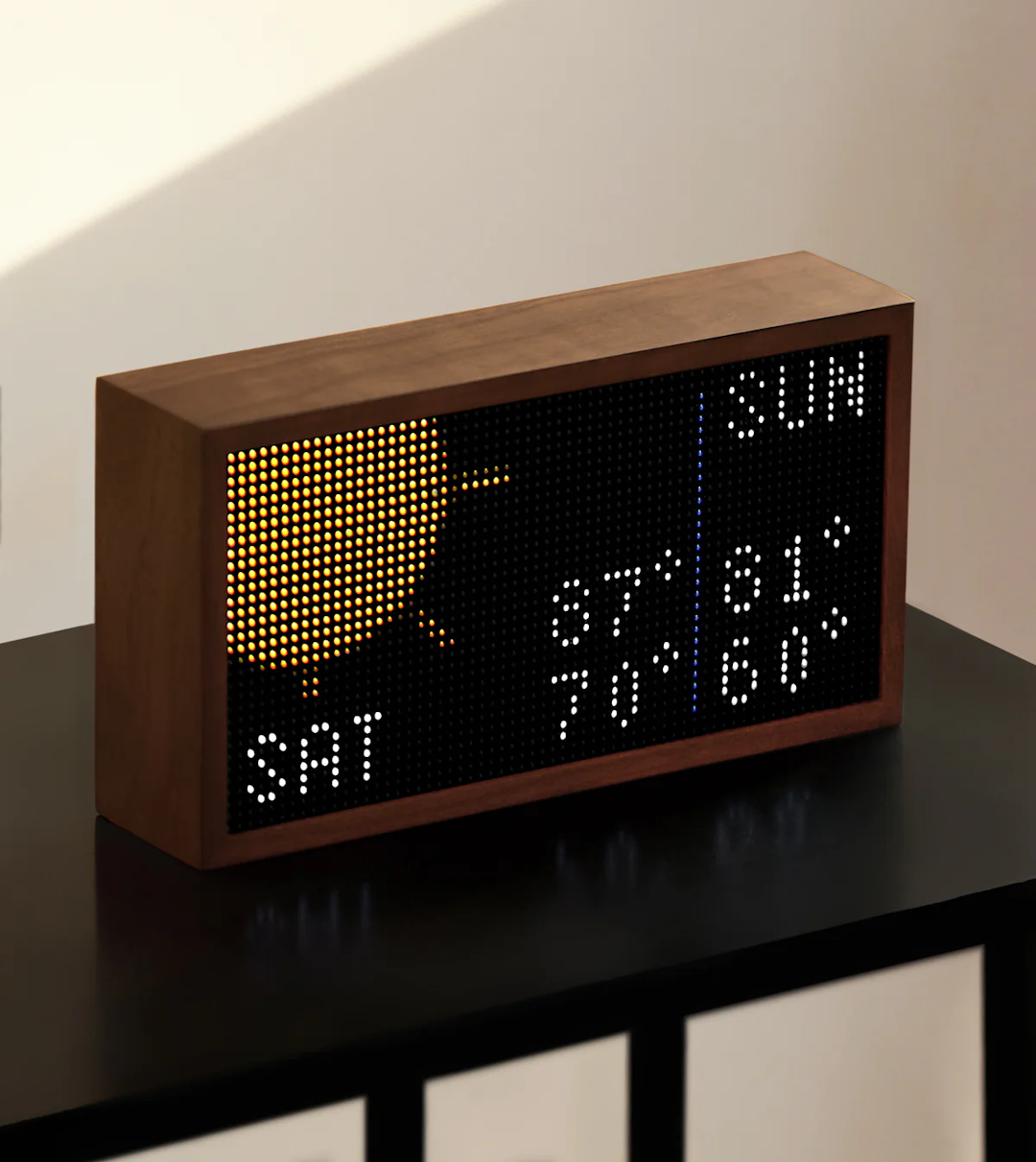
Tidbyt is a "retro-style display" that shows information about weather, transit, finance, sports, and all sorts of other things. It's a 64x32 pixel internet-connected screen, and it kind of looks like a Lite-Brite. It's basically an expensive tech toy. David Pierce explains it way better than I can.
The key thing is, you can write apps for it.
I'd been thinking I should try and build something for it ever since I got one. Now and then, my partner and I will say to each other, "wouldn't it be cool if we could see (thing) on the Tidbyt?"
I do computers, let's do this.
My Apps
WQXR
This shows what's currently playing on WQXR, New York's Classical Music Radio Station, on the Tidbyt.
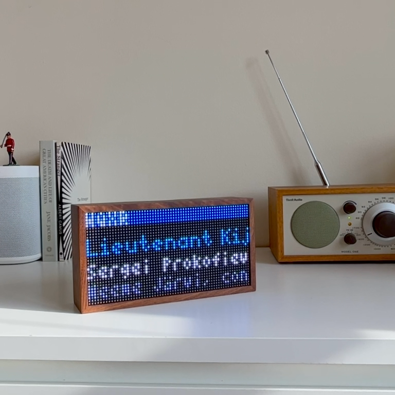
I made this app because we frequently listen to WQXR at home, and we sometimes find ourselves asking "what piece is this?" or "who's the composer?" so this scratches that itch.
This was my first Tidbyt app, but I structured it to be reusable for other radio stations.
It basically just grabs data from WQXR's "what's on" endpoint, formats it, and displays it nicely on the Tidbyt.
It uses Pixlet's Starlib HTTP module to request the data, and it polls at a specified interval to check if the data has changed.
Using Tidbyt's configuration Schema, I added a few settings for the user to change:
- Scroll direction: Choose whether to scroll text horizontally or vertically
Horizontal Vertical 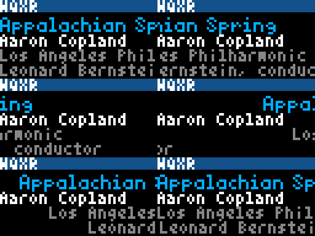
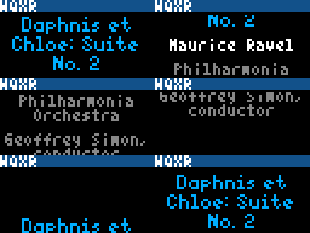
- Scroll speed: Slow down the scroll speed of the text
- Show ensemble: Show the ensemble, if applicable
- Show conductor and soloists: Show the conductor and/or soloist(s), if applicable
- Use custom colors: Choose your own text colors
- Color: Title: Choose your own text color for the title of the current piece
- Color: Composer: Choose your own text color for the composer of the current piece
- Color: Ensemble: Choose your own text color for the ensemble
- Color: Conductor/Soloists: Choose your own text color for the conductor/soloists
When the app got published to Tidbyt's Community Apps, I commemorated it with an Instagram reel.
KQAC
This shows what's currently playing on All Classical Radio on the Tidbyt.

It's basically the same as the WQXR app, except it uses data from All Classical Radio's website.
All Classical Radio (previously All Classical Portland) was my local classical music radio station when I was growing up, and I still turn it on with the web stream from time to time. I thought it would be a fun nod to my hometown, and a useful exercise to see how reusable my WQXR app's structure could be.
KQAC has some minor internal differences from WQXR. If you're curious, they are here:
- Soloist/Ensemble/Conductor: I had to combine these three into one setting called "Show ensemble info" because All Classical sometimes returns soloist data in the ensemble response
- I noticed that if there is more than one soloist, it can return one in the actual "soloist" value, and the other(s) in the "ensemble" value; I'm guessing because they want these to show on separate lines on their web UI.
- I felt like it would be weird if you had "Show ensemble" turned on then saw random soloist data somehow, so everything's under one setting
- Composer Names: Tiny thing, but All Classical lists the composer's last name first (like "Brahms, Johannes"); WQXR does it like "Johannes Brahms"
My developer brain wants everything to be completely consistent, but the reality is that the only people who will notice are the ones who happen to use both apps. I'm over it. 🤷♀️
WNYC
This shows what's currently playing on WNYC on the Tidbyt.

I threw this one together because I had some momentum after building the other two apps, and I wanted to see if my structure could extend beyond just classical music apps.
Key points about this app:
- Stream: I added an option to choose between the FM or AM stream of WNYC. This was a simple substitution and a new setting, so I thought it was easy enough to add. In the future, I could see supporting more streams if it makes sense (maybe NJPR, idk).
- Layout Settings: In this app, I decided to be a little more opinionated about the layout settings. In previous apps, I let the user choose their own scroll direction, scroll speed, and amount of information. On the WNYC app, I decided to constrain these choices by letting the user instead change the "layout", which was just a combination of the other three settings in a thoughtful way. I settled on the following layouts:
| Name and Image: The show's title, and the show's image. Title scrolls horizontally next to the image. | 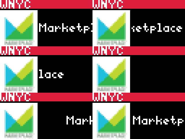 |
| Name and Description: The show's title, and the "description" of the show. Scrolls vertically, but slower. (For some shows, the "description" is used for information about the particular episode; for other shows, it's just generic information about the show) | 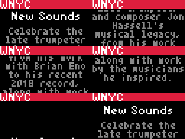 |
| Name only: Just the show's title, no other info. Wraps and scrolls vertically if it gets too long. | 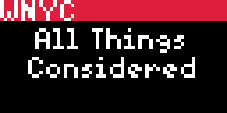 |
BBC Sounds
This shows what's currently playing on various stations on BBC Sounds on the Tidbyt.

I threw this one together two years after the other apps, because I wanted to see if I could get Cursor to build a Tidbyt app for me.
I used AI to build this app. See my addendum below about this one.
Key points about this app:
- Multi-Station Support: Ability to choose from 15 major BBC Radio stations
- Station-Branded Colors: Each station displays with its official BBC brand colors
- Two Display Modes: Because the BBC's API returns different data for the "current track" and "programme" endpoints, I added a setting to choose between the two, with an intelligent fallback to the other mode when the current track data isn't available:
| Current Track: Shows details of the currently playing music/content (default) |  |
| Programme: Shows current programme information. When track details aren't available, the app automatically falls back to programme information. |  |
Development Environment
Tidbyt's team has done a fantastic job at making good tools (like Pixlet) for developing for the device.
In my own workflow, I put together a few other helpful pieces to make my own development experience more comfortable.
My repo
I build in my andrewwestling/tidbyt repo. When I'm ready to publish an app to the community, I make a copy of my code with the comments removed, then push to my fork of tidbyt/community and make a PR from there.
Mock Endpoints
Because each of my apps just reads JSON data from a web endpoint, I decided to set up a local endpoint that could serve mock responses for different situations.
The data on the real endpoint changes relatively often, and I want to be able to test after it's gone, so having some way to capture and test in a controlled way was really helpful.
My process for creating my mock data was this:
- Open to the radio station's real web endpoint in a browser
- Copy the entire data of the response
- Paste the data into a new JSON file in the "mocks" folder
- Save the file with a descriptive name
- Run a local HTTP server, and point it at the "mocks" folder where all my JSON files are saved
- (Basically,
python3 -m http.server 8080 --directory ./mocks)
- (Basically,
- Replace the endpoint path in my app to point at a particular JSON file on the server I'm running
Somewhere at the top of each app, I kept a bunch of commented-out lines corresponding to the different files I had saved in the "mocks" folder.
When I wanted to see how the app handled a particular response, I uncommented the corresponding line, which caused my app to use the mock data instead of the real data from the radio station.
Good enough 🤷♀️
Some general notes about this:
- For the classical stations:
- Combinations of Data: Some pieces have any combination of a conductor, ensemble name, soloists, and even other potentially-interesting things to show; I tried to capture scenarios like the below:
- with a conductor (i.e. a regular symphonic work)
- with a conductor and soloist(s) (i.e. a concerto)
- without a conductor
- without an ensemble name (i.e. a sonata)
- with a long composer name (for layout and text wrapping)
- with a long song title (for layout and text wrapping)
- between songs (no catalog item)
- specific show (a particular show without catalog item, i.e. NYPhil broadcast)
- Capture the Weird Stuff: The currently-playing piece changes relatively often. If I see a particular piece or show that I want to test the layout with, it's helpful to capture the response immediately (using the steps above to save it to my "mocks" folder) then serve it from my local endpoint; there's a good chance the piece will change before I'm done with my work, so this protects against that
- Long Titles: Some piece titles can get pretty long; there are still a few rough edges in my layouts with this, particularly when a single word is longer than 64px wide when using the "vertical" scroll direction, or just when a piece title is generally long when using the "horizontal" scroll direction
- No Catalog Item: Sometimes there is special programming (e.g. "The New York Philharmonic This Week") and we don't get the data about what particular song is playing (the "catalog item"); in these cases, we still want to show something meaningful, so we display the title of the show, instead of the title of the piece.
- Combinations of Data: Some pieces have any combination of a conductor, ensemble name, soloists, and even other potentially-interesting things to show; I tried to capture scenarios like the below:
- For the non-classical stations (like WNYC or other NPR stations):
- Program, Not Piece: Usually what's currently playing is a program, not a particular piece or song
- Infrequent Changes: Programs change less frequently (maybe every 30 or 60 minutes)
- Schedule: There's usually a schedule on the website of the programs for that day, so you know what to expect; I found this helpful so I didn't have to listen to the station all day to wait for the endpoint data to change
See examples of my mock data on GitHub: WQXR, WNYC
VS Code Tasks
As with any project I work on, I like to use Tasks in Visual Studio Code to reduce cognitive load when I need to start/stop/run commands in the development environment.
I set up the following tasks:
- Pixlet: Serve: Start the app in Pixlet
- Pixlet: Format: Format with Pixlet's built-in formatting
- Pixlet: Render and push to my Tidbyt: Render and push it to my actual device
- Pixlet: Generate the preview gif: Generate the preview GIF for my README
- Mocks: Start server: Serve mock responses from my local machine for different scenarios from the real endpoint
I configured my repo's tasks to use an input variable to choose which app I wanted to start.
See my tasks.json file on GitHub
Takeaways
- Unintended Uses: I built the app for the use-case of "I'm currently listening to the radio; what am I listening to?" As I lived with the app more, I found myself glancing at the Tidbyt throughout the day and seeing that a piece I liked was currently playing, prompting me to go turn on the radio and listen. Kind of the opposite of what I intended when I made it, but a fun little surprise.
- Replicable: These apps ended up being kind of "formulaic." I'd love to make more of these. I just did my favorite radio stations, but they were pretty easy to make. I could see making a generic "New York Public Radio" app that gives you a setting to choose which station to show, but I decided not to do that because there are nuances with displaying information about classical music that don't translate to other stations.
- Minor Inconsistencies: Between the three apps, there are minor inconsistencies; no one will care from the outside. I know they're there, but the users don't. Helpful to remember this.
- New API?: I think New York Public Radio might be moving to a new API at some point; I noticed the newer "Radio" page for WNYC was pointing to a different API than WQXR, even though the one WQXR points to has an option for getting data for WNYC if you specify that as the path. Basically, I'm expecting to have to migrate the NYPR apps to the newer API once everything is using it. I did capture some responses from it in the v4 folder of WNYC's mock API responses, just in case
- Horizontal Marquees are Slow: On the classical music apps, I was getting impatient waiting for horizontal marquees to finish scrolling for a long title. This prompted me to add the "vertical" mode, as an alternative for people like me. My partner still likes the horizontal mode, that's why there's both options.
- Radio Fatigue: Listening to WNYC all day is actually kind of exhausting. There's a lot of bad news these days. Building the classical music apps was easier and more enjoyable because the music just feels better 😌
- Tidbyt's Cloud: Something I didn't expect is that very little computation happens on the Tidbyt device, itself. It all happens in the cloud, and once your device is connected to Wi-Fi, it just sends heartbeats to the cloud, which returns rendered WebP images for the device to display. In retrospect, this actually is kinda brilliant architecture; it just wasn't what I expected.
- Stale Data: When building this, I ran into some questions/issues with how to make sure the device would update its data at the right time. I was expecting to have to manage a cache entry with a time-to-live that corresponded to the current song's length, but I learned that Tidbyt's cloud is simultaneously simpler and dumber than I expected, so trying to exert that kind of control over cache entries wasn't that important. Instead, just using a regular interval (like, once a minute) worked better and was more predictable. The device sends a heartbeat every minute, at least, and as long as I tell my app to refetch the data and re-render at least once a minute, the device should pick up the new changes and be out-of-date for no longer than 60 seconds at a time. Keep it simple.
- "Ambient Information": As with other Tidbyt apps, it's fun to have this kind of information just around and available without having to go seeking it 🤗
Addendum: BBC Sounds App
(Added 2025-06-15)
I recently started listening to BBC Radio 3 more for classical music, after coming across this Reddit thread and this comment that resonated with me.


My classical stations are usually pretty good, but there are definitely days I want more than a Beethoven Symphony or Eine Kleine Nachtmusik.
In the kitchen, I have my Tidbyt showing both of my WQXR and All Classical Radio apps, rotating between them. We usually have either of these stations on throughout the day, and I look to the Tidbyts to see what's on when I'm listening.
With my newfound BBC Radio 3 on the speakers, I wanted to know what I was listening to. I didn't have an app for that.
Luckily, I've grown a lot since I made my last set of Tidbyt apps. I've been using AI tools like Cursor a lot in my work and personal life lately.
This new radio app felt like something AI could do well for me.
I decided to dust off my Tidbyt repo and see if I could prompt together a BBC Radio 3 app from my existing templates/structures.
Using AI
I really just needed to do two things:
- find BBC's API endpoints for their "now playing" pages
- adjust the apps to accept the formats from BBC
Perplexity: Get me the API endpoints
For the first task, this felt like something Perplexity would be able to help with. I pulled it open and asked a very naive question like this:
Does BBC Radio 3 have a JSON endpoint that shows what is currently playing?
This gave me a crystal clear, correct answer in less than a minute. Great.
Cursor: Adapt my existing app to BBC Radio 3
For the next task, I opened my andrewwestling/tidbyt repo in Cursor, then started prompting like I usually do, adding context where appropriate:

I'd like to make a new app like my others in
@wqxr.starand@kqac.starthat works for BBC Radio 3 in a similar wayThey have an endpoint at @https://rms.api.bbc.co.uk/v2/services/bbc_radio_three/segments/latest that displays what is playing
Can you generate a new "app" called
bbcradio3in the same structure as the others@/wqxrand@/kqacthat works with BBC Radio 3?
With that prompt, Cursor (and Claude 4 Sonnet) got it mostly correct on the first try.
Perplexity and Cursor: Extend the app with more info
After playing with the first iteration, I noticed that BBC's API returns less info than WQXR or All Classical Radio did, so I started wondering if I could get a little more information.
I went back to Perplexity and asked another simple, unrefined query:
Does BBC Radio have a JSON endpoint that shows what the current "Show" is? This Schedule endpoint https://www.bbc.co.uk/sounds/schedules/bbc_radio_three#live
Perplexity nailed it again, and got me another correct answer, with information on BBC's "broadcasts" endpoint.
I copied the endpoint it found, then went back to Cursor and asked it to extend the app to show the current show's name:

Would it be possible to incorporate the "current show" endpoint into the BBC Radio Player app somehow? I would like to see that we are listening to the Choral Evensong show, and that the currently playing song is (song)
We could add this as a configuration option like "Include Show Name" and let the user turn it on or off
The endpoint for shows is here: @https://rms.api.bbc.co.uk/v2/broadcasts/latest?service=bbc_radio_three&on_air=now
At this point, I had basically everything I wanted from the app.
I went back and forth with Cursor on some refinements of the "last 20%":
- editing display behavior
- creating "mock data" for me to use with my test setup
- writing a README in the style of the other apps' READMEs
- adding error handling and fallbacks
I was getting ready to publish the app, but realized I was a small step away from way more utility.
Cursor: Make it work with all the BBC Sounds stations
It felt shallow to just support BBC Radio 3, when all of BBC's radio stations were available from the same endpoint.
I prompted a little more to rework the app to support all of BBC's streams available on BBC Sounds, with a configuration option to choose which stream to display:

We've just made a
bbcradio3app specifically for BBC Radio 3, but I'm wondering if it would be a heavy lift to reconfigure it and make it generic to all BBC Radio stationsAll stations are available here: @https://www.bbc.co.uk/sounds/stations
I believe the endpoints follow the same structure
Could we rework the following like this:
- new
bbcsounds(BBC Sounds) app in/bbcsounds- Same contents as the bbcradio3 app, but new configuration option for "Station" with all the options from the page above for stations
- Show the current station in the HEADER_BAR and color it according to that station's color
- Support the same "broadcasts" or "segments" behavior of the existing one
This got me to about 80% for supporting all stations.
I went back and forth with some more refinement prompts:
- adding some stations it missed in the list
- adding mock data for the testing setup
- refining the colors used so the contrast would be appropriate
- updating the README to reflect the functionality
I also refined a few parts by hand before committing and packaging it all up.
Overall
Really impressed with how fast this came together. I went from "I want to try a new radio station" to "the 'now-playing' data is showing on my Tidbyt" in less than a day.
Having structured apps for Cursor to copy was key in this situation. Knowing what context to give to the model, and knowing what I wanted to change about it, were both things I still feel are "software engineering skills" in the sense that expertise is still required for doing this effectively.
Overall, a fun little afternoon project 😎
Originally posted: 2023-08-07
Last updated: 2025-06-15